GCSE Tutoring Programme
"Our chosen students improved 1.19 of a grade on average - 0.45 more than those who didn't have the tutoring."
In order to access this I need to be confident with:
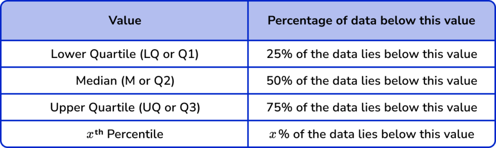
MedianThis topic is relevant for:

Cumulative Frequency
Here we will learn about cumulative frequency, including how to draw a cumulative frequency graph, and how to read and interpret a cumulative frequency graph including box plots.
There are also cumulative frequency worksheets based on Edexcel, AQA and OCR exam questions, along with further guidance on where to go next if you’re still stuck.
What is cumulative frequency?
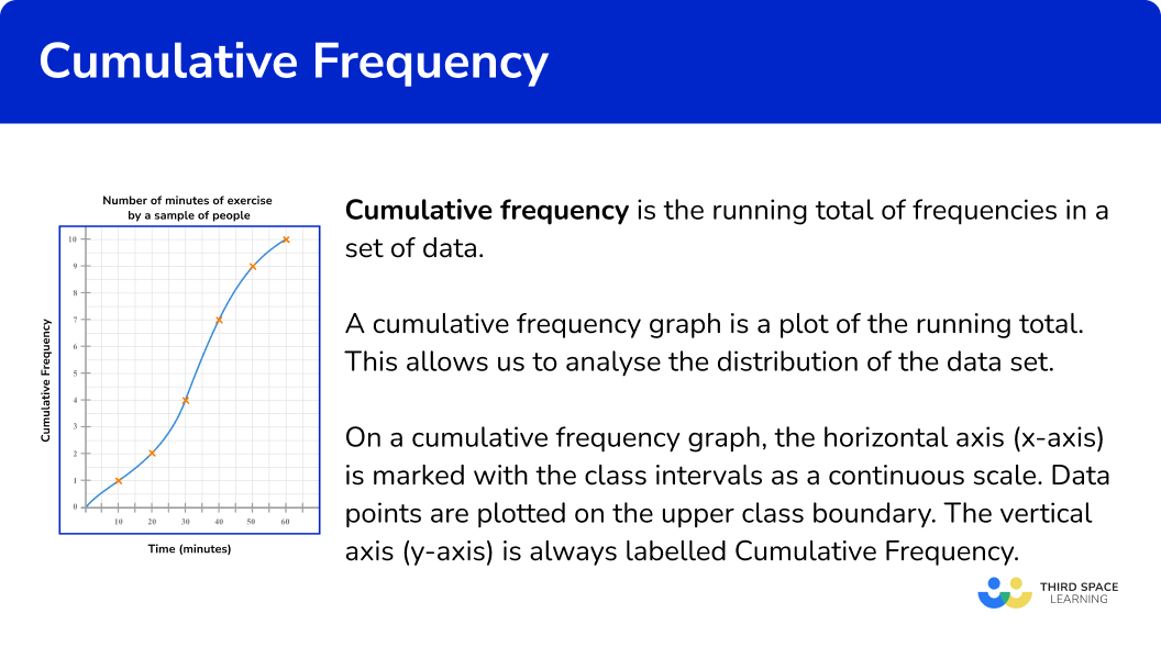
Cumulative frequency is the running total of frequencies in a frequency distribution.
Cumulative frequency graphs (or cumulative frequency diagrams) are useful when representing or analysing the distribution of large grouped data sets. They can also be used to find estimates for the median value, the lower quartile and the upper quartile for the data set.
The horizontal axis of a cumulative frequency graph is marked with the class intervals from the data set to be plotted on a continuous scale. Data points are plotted on the upper class boundary.
The vertical axis of a cumulative frequency graph is always labelled cumulative frequency.
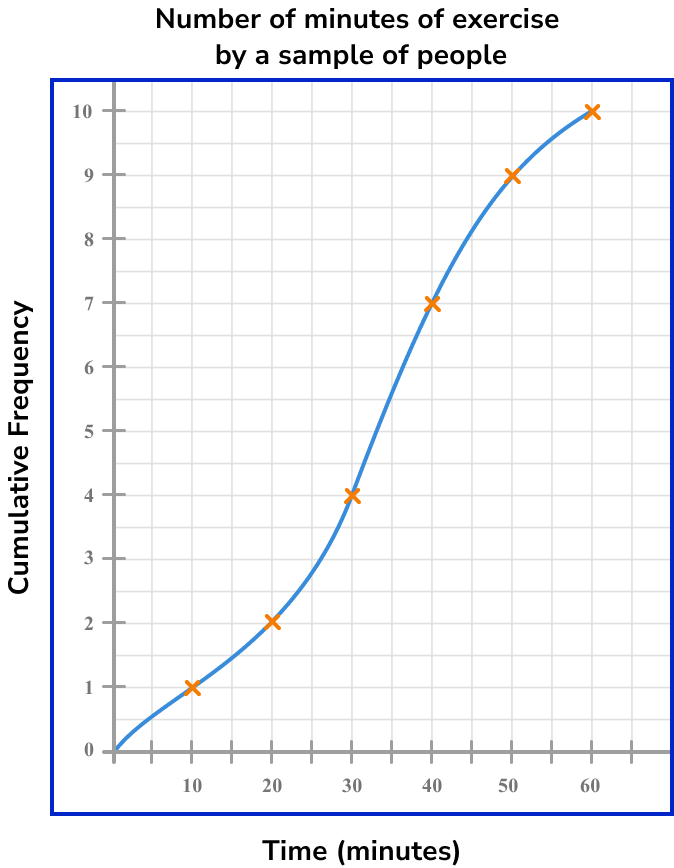
In many cases, a cumulative frequency curve has a distinctive ‘s-shape’, like the one above. This is because the majority of data is usually located in the middle class intervals, with fewer items of data at the furthest values in the range of the data set. You should not assume this for all cumulative frequency diagrams.
Note, the gradient of a cumulative frequency curve is always positive.
What is cumulative frequency?
How to draw a cumulative frequency graph
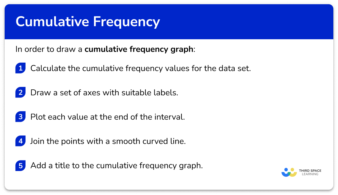
In order to draw a cumulative frequency graph:
- Calculate the cumulative frequency values for the data set.
- Draw a set of axes with suitable labels.
- Plot each value at the end of the interval.
- Join the points with a smooth curved line.
- Add a title to the cumulative frequency graph.
Explain how to draw a cumulative frequency graph
Cumulative frequency worksheet
Get your free cumulative frequency worksheet of 20+ questions and answers. Includes reasoning and applied questions.
DOWNLOAD FREE Cumulative frequency worksheet
Get your free cumulative frequency worksheet of 20+ questions and answers. Includes reasoning and applied questions.
DOWNLOAD FREECumulative frequency examples
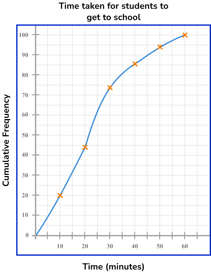
Example 1: drawing a cumulative frequency graph
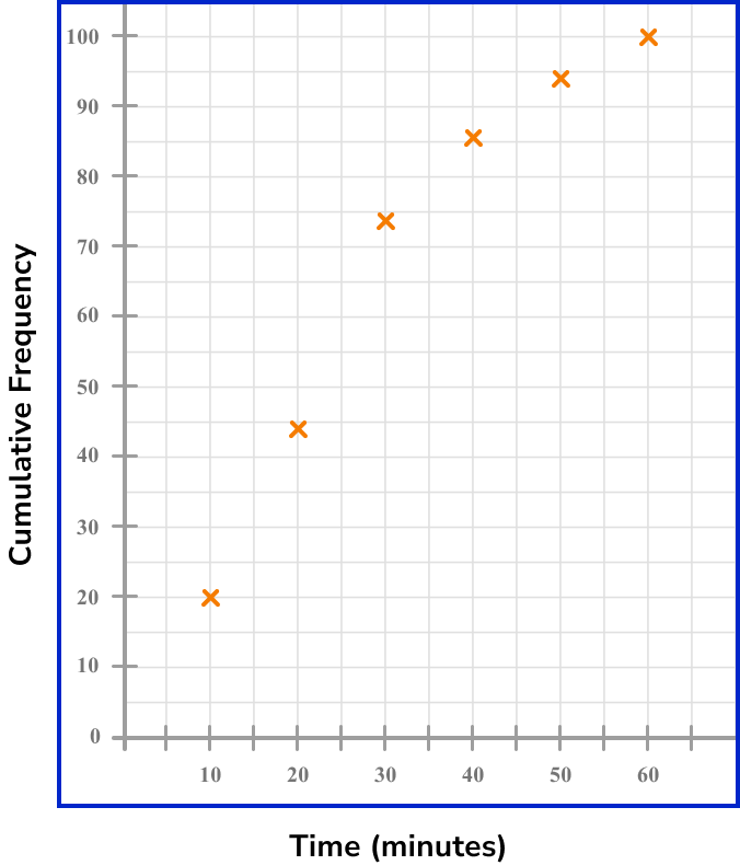
This table shows the time (in minutes) that 100 students take to get to school.
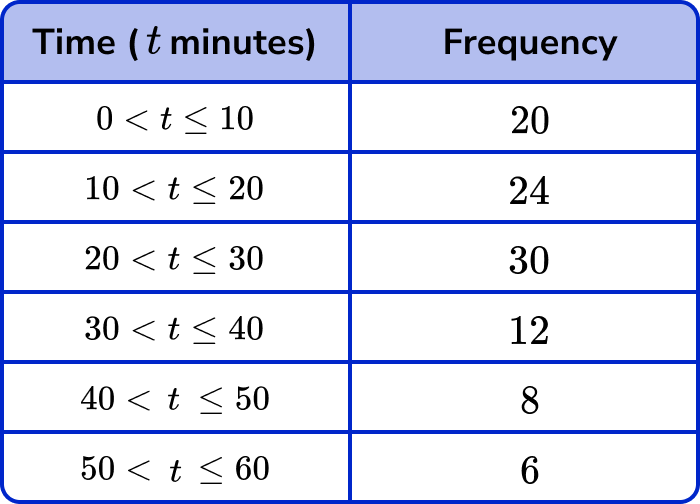
Draw a cumulative frequency graph to represent this distribution.
- Calculate the cumulative frequency values for the data set.
The cumulative frequency is the running total for the data. The first value for the cumulative frequency is always the first frequency. To calculate the cumulative frequency of the next row, we add the current value for the cumulative frequency and the frequency for the next class interval.
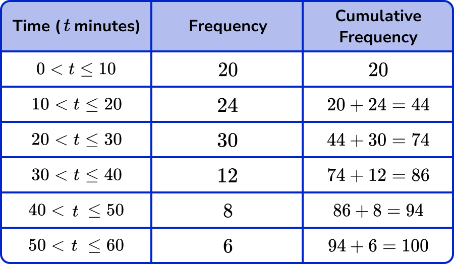
The question states that there are 100 students. The cumulative frequency must therefore total 100 . If not, go back and check each value for the cumulative frequency again.
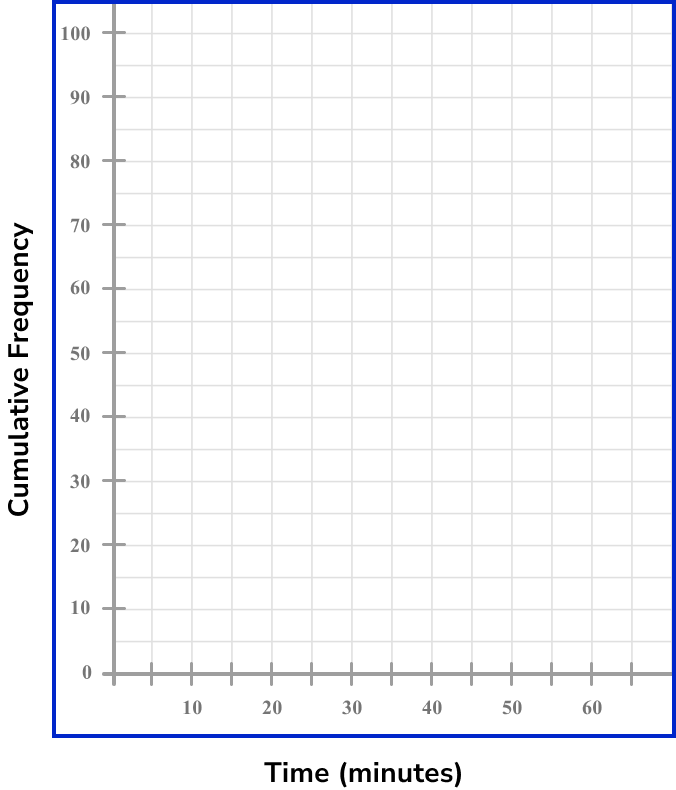
2Draw a set of axes with suitable labels.
The horizontal x -axis is time in minutes, so we should label this axis from 0 to 60. Cumulative frequency is on the vertical y -axis, and so we label this axis from 0 to 100.
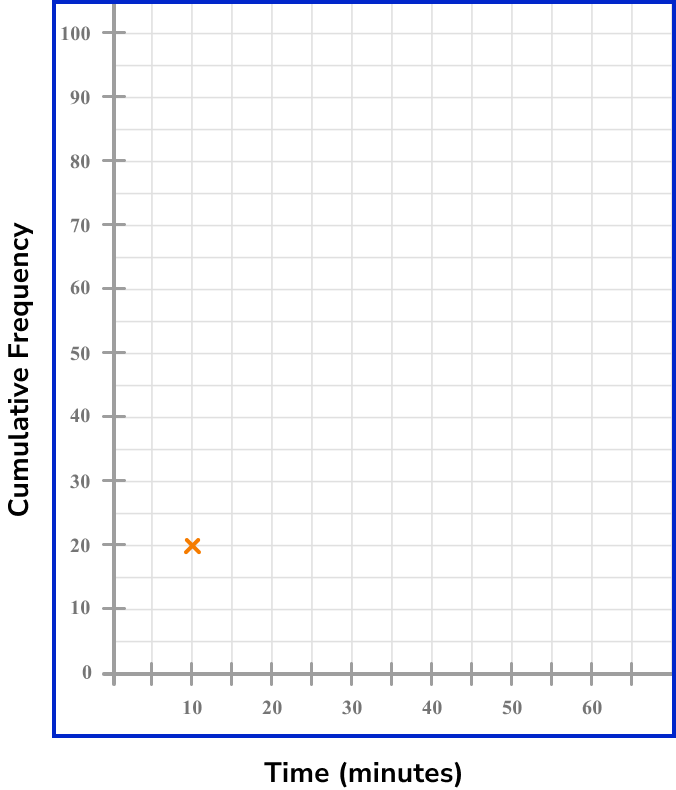
3Plot each value at the end of the interval.
As we only know the total frequency at the end of the interval, we plot the cumulative frequency at the upper class boundary.
For the interval 0 < t \leq 10 with a cumulative frequency of 20, we plot the coordinate (10,20).
For the next interval, we plot the coordinate (20,44).

Continuing this for all the remaining intervals, we get the following plot.
4Join the points with a smooth curved line.
The line must be continuous and go through each point of the cumulative frequency. As the initial frequency is 0, the curve must start at (0,0).
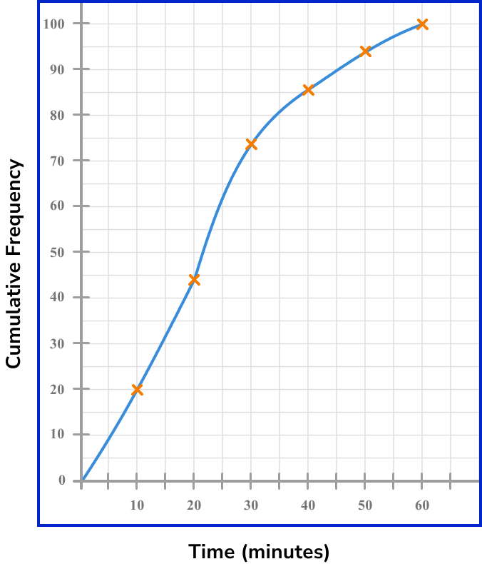
5Add a title to the cumulative frequency graph.
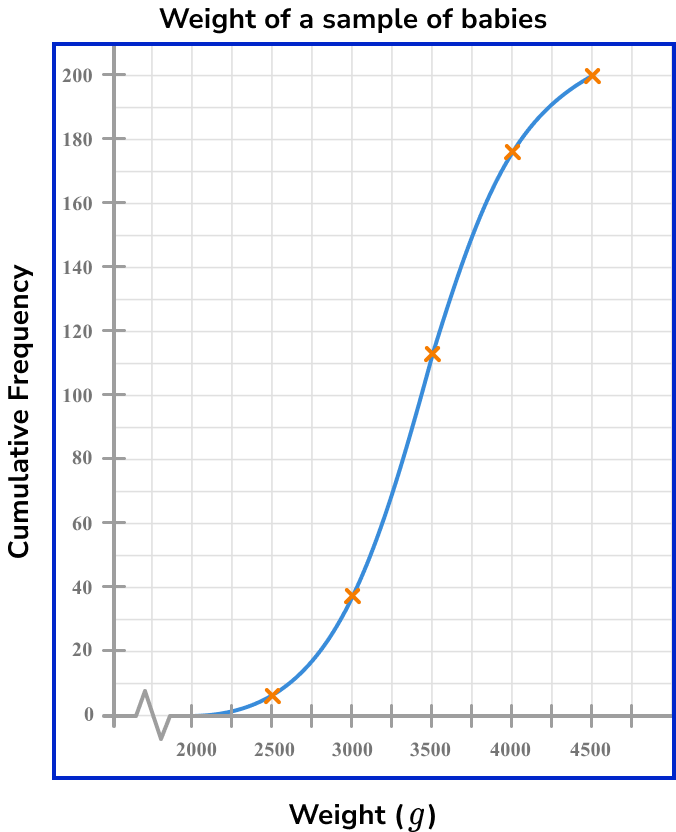
Example 2: drawing a cumulative frequency graph with an axis break
These tables below show the birth weights (g) of 200 babies.
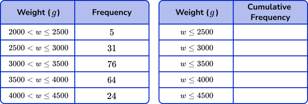
Draw a cumulative frequency graph to represent this distribution.
Calculate the cumulative frequency values for the data set.
The first table shows the frequency of each class interval as the weight w has an upper and lower boundary. The second table above shows the cumulative frequency. This is shown as the inequality value for w only has an upper boundary, showing that this interval includes all frequencies up to that weight.
We need to write the cumulative frequency values into the second table.
The cumulative frequency for the first interval is 5.
The cumulative frequency for the second interval is 5 + 31 = 36, and so on.
Again, the final cumulative frequency value is 200, which matches the frequency in the question.
Note: The final cumulative frequency value is usually a “nice” number (a multiple of 5 or even).
Draw a set of axes with suitable labels.
The horizontal axis values have a range of 2000 to 4500. If we started the axis at 0, there would be a lot of blank space before the cumulative frequency curve begins. We therefore draw a break (a zigzag line) in the axis to compress the space that does not contain values, and write 2000 as the first value after the break on the axis.
The vertical axis is the cumulative frequency. This axis must start at 0 and must not contain a break. The total frequency is 200 and so we can label the vertical axis from 0 to 200 in equal steps of 20.
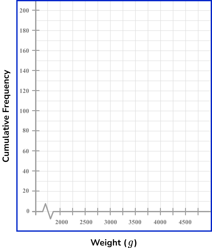
Plot each value at the end of the interval.
Plotting each value at the upper boundary of the interval, we have
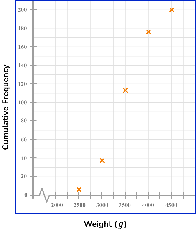
Join the points with a smooth curved line.
As the lowest weight value can be 2000g, we start the line from (2000,0) and draw a continuous, smooth curve through all of the plotted values, up to the final point.
Add a title to the cumulative frequency graph.
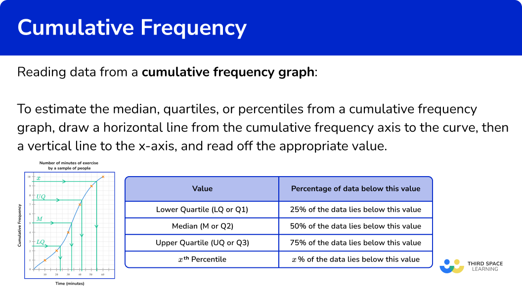
Reading data from a cumulative frequency graph
A cumulative frequency graph can be used to estimate the median, quartiles, and other percentiles for a data set. This is because all of the values within the data are in increasing order.
To find the location of any percentage of data, we need to know the total frequency of the data.
We then find the percentage of the total frequency.
Below is a brief summary of where some key values lie within the data along with a visualisation of each value using a cumulative frequency diagram.
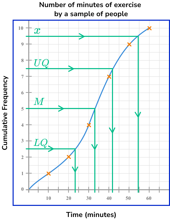
Step-by-step guide: Quartile
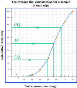
For example, let us locate the median for the following cumulative frequency diagram.
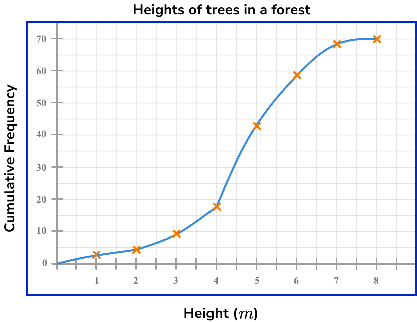
The total frequency for this data set is 70.
The median marks the location of where 50\% of the data lies below.
Calculating 50\% of 70 \ (=35), the location of the median for this data lies where the 35th value in the data is.
We draw a horizontal line from 35 on the cumulative frequency axis to the curve, and then draw a vertical line to the x -axis, and read the corresponding value.
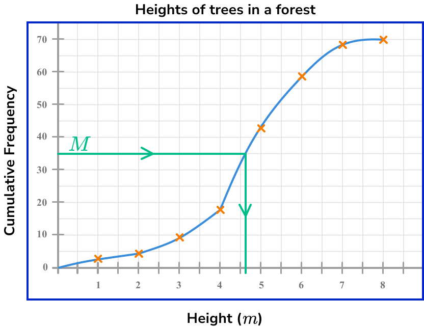
The median height of trees in a forest is therefore 4.7m.
Reading data from a cumulative frequency graph
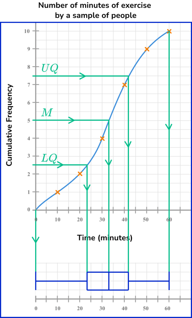
Box plots
It is convenient to construct a box plot (or a box and whisker diagram) directly below a cumulative frequency curve. This is because we can locate an estimate for the required values (the lower quartile, the median, and the upper quartile) using the method described above, along with the highest and lowest values for the range.
Remember, the box plot also needs to lie on a scale and so this must also be drawn (replicate the x -axis below the box plot). See the example below.
Step-by-step guide: Box plots
Estimating values from a cumulative frequency graph
In order to estimate the median, quartiles, or percentiles from a cumulative frequency graph:
- Find the value corresponding to the median/quartile/percentile on the cumulative frequency axis.
- Draw a horizontal line from this value across to the cumulative frequency curve.
- Draw a vertical line from the curve to the \bf{x} -axis, and read off the corresponding data value.
Estimating values from cumulative frequency examples
Example 3: estimating the median from a cumulative frequency graph
Below is a cumulative frequency diagram showing the time taken for 120 students to run 100m.
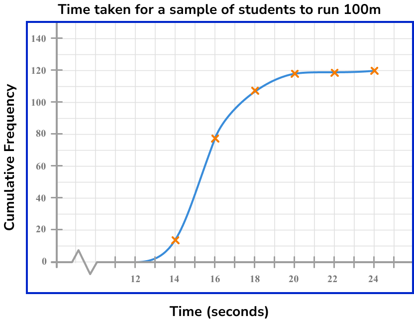
Calculate an estimate for the median.
Find the value corresponding to the median/quartile/percentile on the cumulative frequency axis.
In this case, we need to calculate the location of the median value. There are 120 students and so there are 120 pieces of data. In order to find the median, we calculate 50\% of 120 and locate this value on the cumulative frequency axis.
\frac{50}{100}\times{120}=60
We need to find the time for the 60th item of data.
Draw a horizontal line from this value across to the cumulative frequency curve.

Draw a vertical line from the curve to the \bf{x} -axis, and read off the corresponding data value.
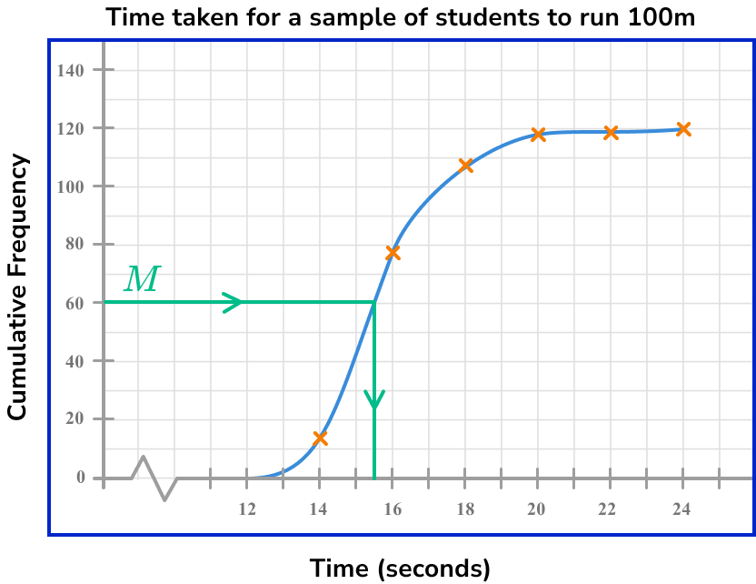
An estimate for the median time for a student to run 100m is approximately 15.3 seconds.
Example 4: estimating the interquartile range from a cumulative frequency graph
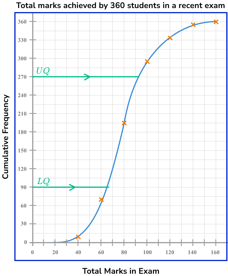
The cumulative frequency graph below shows the total number of marks achieved by 360 students in a recent exam.
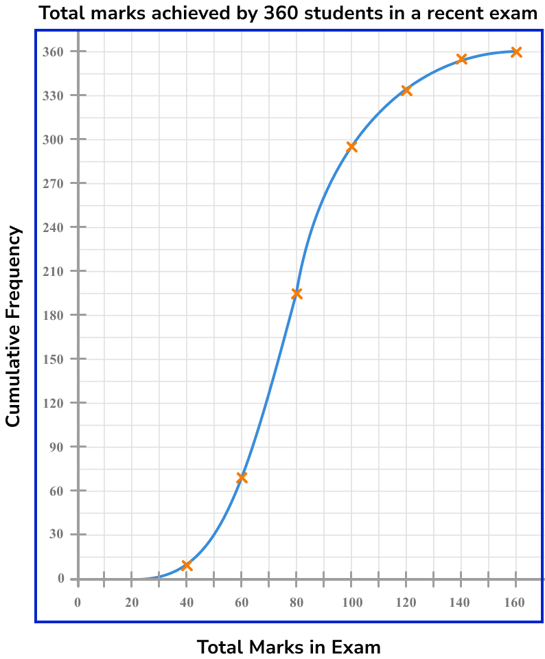
Estimate the interquartile range for the data.
Find the value corresponding to the median/quartile/percentile on the cumulative frequency axis.
As the total frequency of students is 360, we need to find 25\% and 75\% of 360 for the lower and upper quartile respectively.
Lower quartile
\frac{25}{100}\times{360}=90^{\text{th}}\text{ value}
Upper quartile
\frac{75}{100}\times{360}=270^{\text{th}}\text{ value}
Draw a horizontal line from this value across to the cumulative frequency curve.
As we need to locate two values (the 90th and 270th value), we can draw a horizontal line from each value on the y -axis to the curve.
Draw a vertical line from the curve to the \bf{x} -axis, and read off the corresponding data value.
Drawing a vertical line for each value from the curve to the x -axis, we get
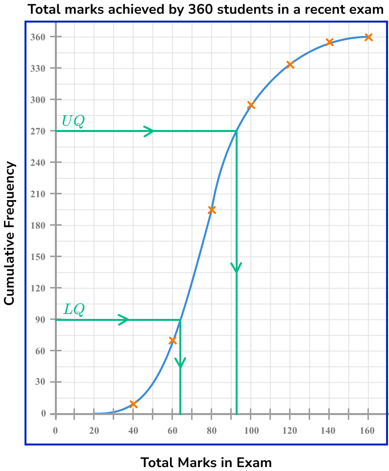
The lower quartile, LQ = 64 .
The upper quartile, UQ = 94 .
The interquartile range, IQR = UQ-LQ = 94-64 = 30.
Step-by-step guide: Interquartile range
Example 5: estimating a percentile from a cumulative frequency graph
This graph shows the height (in cm ) of 150 plants in a border.
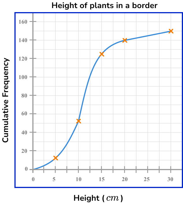
Estimate the value of the 80th percentile.
Find the value corresponding to the median/quartile/percentile on the cumulative frequency axis.
The 80th percentile is the value that is 80\% of the way through the data. Here, as the total frequency is 150, we need to calculate 80\% of 150.
\frac{80}{100}\times{150}=120
So we need the height of the 120th value.
Draw a horizontal line from this value across to the cumulative frequency curve.
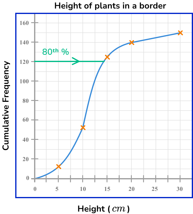
Draw a vertical line from the curve to the \bf{x} -axis, and read off the corresponding data value.
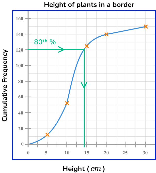
The 80th percentile value (the 120th value) is approximately 14.5cm.
Estimating the frequency/percentile given the data value
In order to estimate the frequency or percentile given the data value:
- Find the data value on the \bf{x} -axis.
- Draw a vertical line from this value up to the cumulative frequency curve.
- Draw a horizontal line from the curve to the \bf{y} -axis, and read off the corresponding value on the cumulative frequency axis.
- Complete any further calculation.
Estimating frequency given the data examples
Example 6: reversing the process to find the percentage
The cumulative frequency graph below shows the average number of steps per day (in thousands) of 72 people.
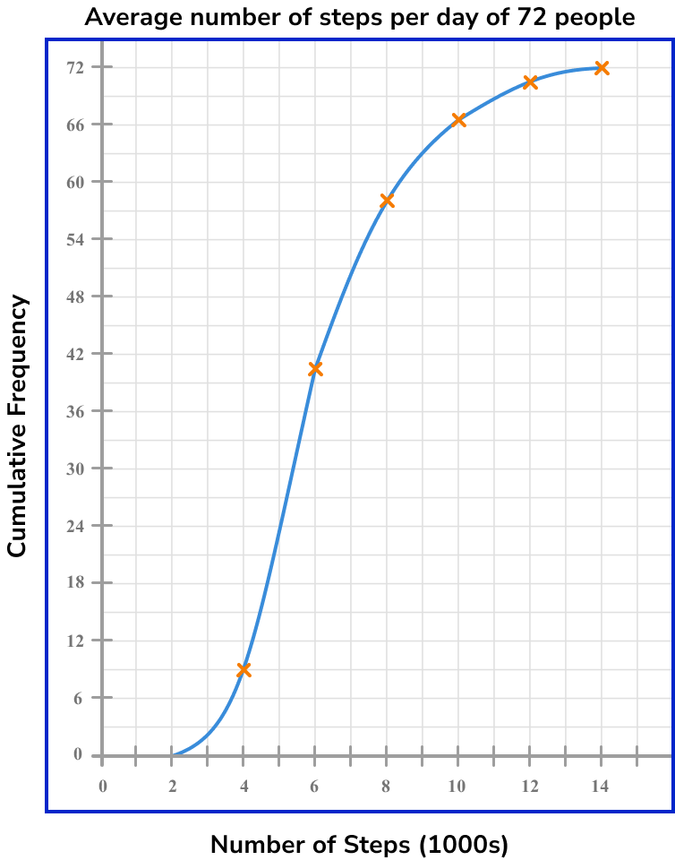
What frequency of people walked more than 7500 steps per day?
Find the data value on the \bf{x} -axis.
As we need to find the value of 7500 and the axis is written in thousands, we need to divide 7500 by 1000 to get our value on the axis.
7500\div{1000}=7.5

Draw a vertical line from this value up to the cumulative frequency curve.

Draw a horizontal line from the curve to the \bf{y} -axis, and read off the corresponding value on the cumulative frequency axis.
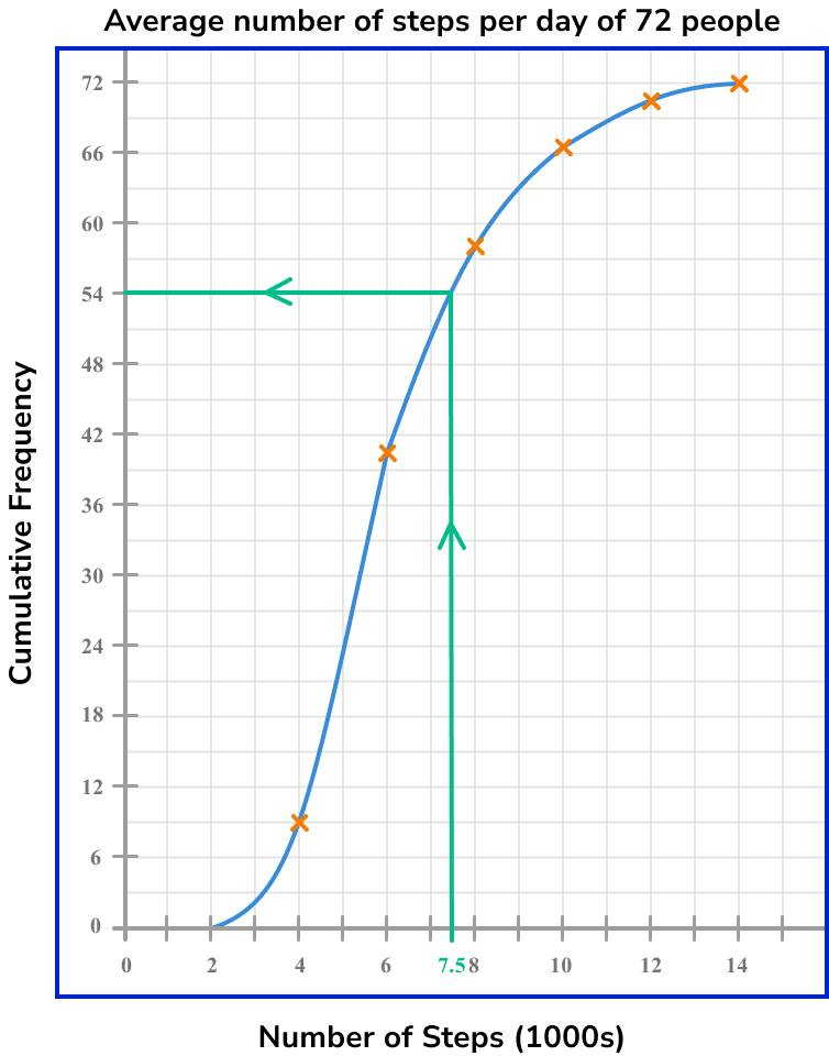
The cumulative frequency value for 7500 steps is 54.
Complete any further calculation.
As the cumulative frequency value for 7500 steps is 54 and the total frequency is 72, the number of people who walked more than an average of 7500 steps per day is
72-54 = 18 .
18 people walked more than 7500 steps per day.
Common misconceptions
- Just plotting the frequencies, rather than working out the running totals
A cumulative frequency graph is usually something like an s-shape, and should always start in the bottom left and finish at the top right of your set of axes. If your graph looks more like a mountain range, you’ve plotted the frequencies rather than the cumulative frequencies.
- Plotting at the midpoint of each class interval
Points on a cumulative frequency graph are always plotted using the upper class boundary of each group – unlike a frequency polygon, which uses the midpoints.
- Joining the start of the curve to \bf{0} on the \bf{x} -axis
The curve should always start at the lowest value in the data set – this is not always 0. If necessary, use an axis break (a zigzag) to show that some data values have been omitted (see Example 2 ).
- A negative gradient in the cumulative frequency curve
The gradient of a cumulative frequency curve must always be positive (or potentially flat when there is no change from one interval to the next). The gradient cannot be negative because the number of items of data is always increasing or staying the same, never decreasing.
- Calculating the median value by halving the \bf{y} -axis value
The median is the location of the 50th percentile value ( 50\% of the data lies below this value). The total frequency may not be the same as the highest value on the y -axis and so make sure you find 50\% of the total frequency, and not 50\% of the highest value on the y -axis.
Practice cumulative frequency questions
1. Below is a grouped frequency table for the length of 44 pieces of string. Calculate the missing cumulative frequency.
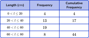


Add 17 in the cumulative frequency column to the next frequency down (19), to get the answer 36.
2. Below is a grouped frequency table showing the height (in centimetres) of 120 students in Year 8. Calculate the missing frequency.
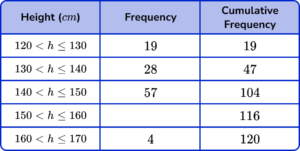
The missing frequency is the difference between the cumulative frequency for the row (116) and the cumulative frequency for the previous row (104).
116-104 = 12.
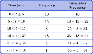
3. Draw a cumulative frequency graph to represent the data in the grouped frequency table below for the length of time waiting on hold on the phone.
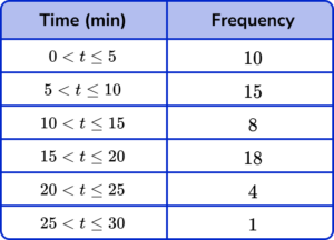
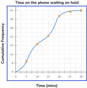

Draw a cumulative frequency column next to the table and use this to calculate the running totals.
Plotting the cumulative frequency at the upper bound of each class interval, we get the following diagram

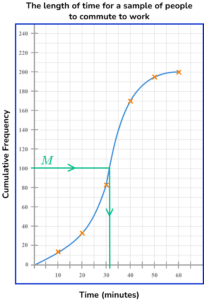
4. This graph shows the commute times of 200 people. Use the graph to estimate the median time taken.
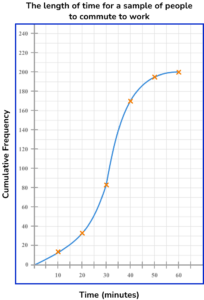
There are 200 pieces of data, so the median is the 100th item (50\% of 200 = 100).
Draw a line from 100 on the cumulative frequency axis to the curve, then down to the x -axis to read off the estimate for the median.
5. This graph shows the time it takes for 200 people to complete the crossword in the local paper. Use the graph to estimate the interquartile range for the data set.
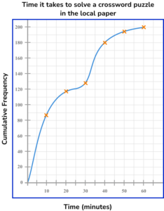
There are 200 pieces of data, so the lower quartile is the 50 item (estimate 5 ) and the upper quartile is the 150th item (estimate 34 ).
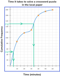
IQR = UQ-LQ = 34-5 = 29
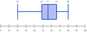
6. Select the box plot that corresponds to the graph below.
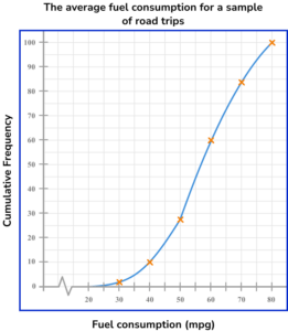
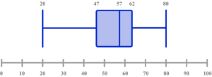
There are 100 pieces of data, so the median is the 50th item, and the quartiles 25th and 75th. Draw lines from 25, 50 and 75 on the cumulative frequency axis to the curve, then down to the x -axis to read off estimates.
LQ = 49
Median = 57
UQ = 66
Use the lower limit of the lowest class interval, and the upper limit of the highest class interval as the minimum (30) and maximum (80) values.
Cumulative frequency GCSE questions
1. The cumulative frequency graph below gives information about the height distribution of a sample of 100 students, correct to the nearest cm.
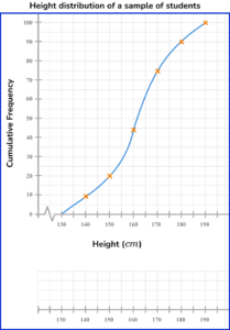
The shortest child is 134cm.
The tallest child is 185cm.
Draw a box plot on the scale provided to represent this distribution.
(3 marks)
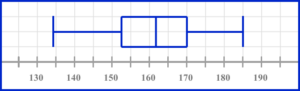
Ends of whiskers at 134 and 185 with a box.
(1)
Median at 162 \ (\pm 1) inside a box.
(1)
Ends of box at 152 \ (\pm 1) and 171 \ (\pm 1) .
(1)
Completed box plot
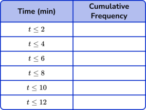
2. The grouped frequency table gives information about the times, in minutes, that 80 children take to complete a jigsaw puzzle.
(a) Complete the cumulative frequency table.
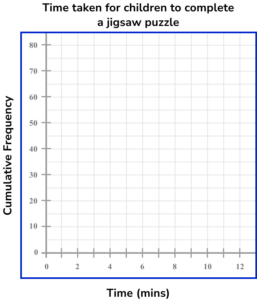
(b) On the grid, draw the cumulative frequency graph for this information.
(c) Use your graph to estimate the percentage of children that took five minutes or less to complete the jigsaw puzzle.
(5 marks)
(a)
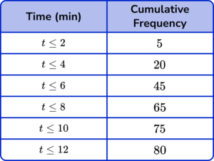
All values correct.
(1)
(b)
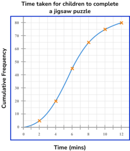
4 or 5 points plotted correctly.
(1)
Smooth continuous curve through all points.
(1)
(c)
Method to read off the graph at 5 on the x -axis – approx 32 on cf axis.
(1)
\frac{32}{80}\times{100}=40 \%(1)
3. The table below shows the weights of trays of produce in a farm shop.
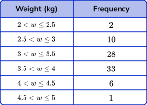
(a) Complete the cumulative frequency table.
(b) On the grid, draw the cumulative frequency graph for this information.
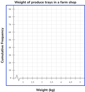
(c) Use your graph to estimate the number of trays that weigh more than 3.75kg.
(6 marks)
(a)
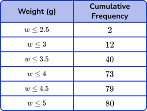
All values correct.
(1)
(b)
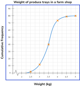
4 or 5 points plotted correctly.
(1)
Completely correct graph.
(1)
(c)
Method to read off the graph at 3.75 on the x -axis – approx 57 \ (\pm 1) on cf axis.
(1)
80- ”their 57 ”
(1)
23 \ (\pm 1)(1)
Learning checklist
You have now learned how to:
- Complete a cumulative frequency table
- Draw a cumulative frequency graph
- Estimate the median and quartiles from a cumulative frequency graph
The next lessons are
Still stuck?
Prepare your KS4 students for maths GCSEs success with Third Space Learning. Weekly online one to one GCSE maths revision lessons delivered by expert maths tutors.

Find out more about our GCSE maths tuition programme.