GCSE Tutoring Programme
"Our chosen students improved 1.19 of a grade on average - 0.45 more than those who didn't have the tutoring."
This topic is relevant for:

Frequency Diagram
Here we will learn about frequency diagrams, including what they are and how to construct them.
There are also frequency diagram worksheets based on Edexcel, AQA and OCR exam questions, along with further guidance on where to go next if you’re still stuck.
What is a frequency diagram?
A frequency diagram is a way of representing data from a frequency table.
Frequency diagrams are usually bar charts, vertical line charts or frequency polygons with frequency displayed on the vertical axis.
What is a frequency diagram?
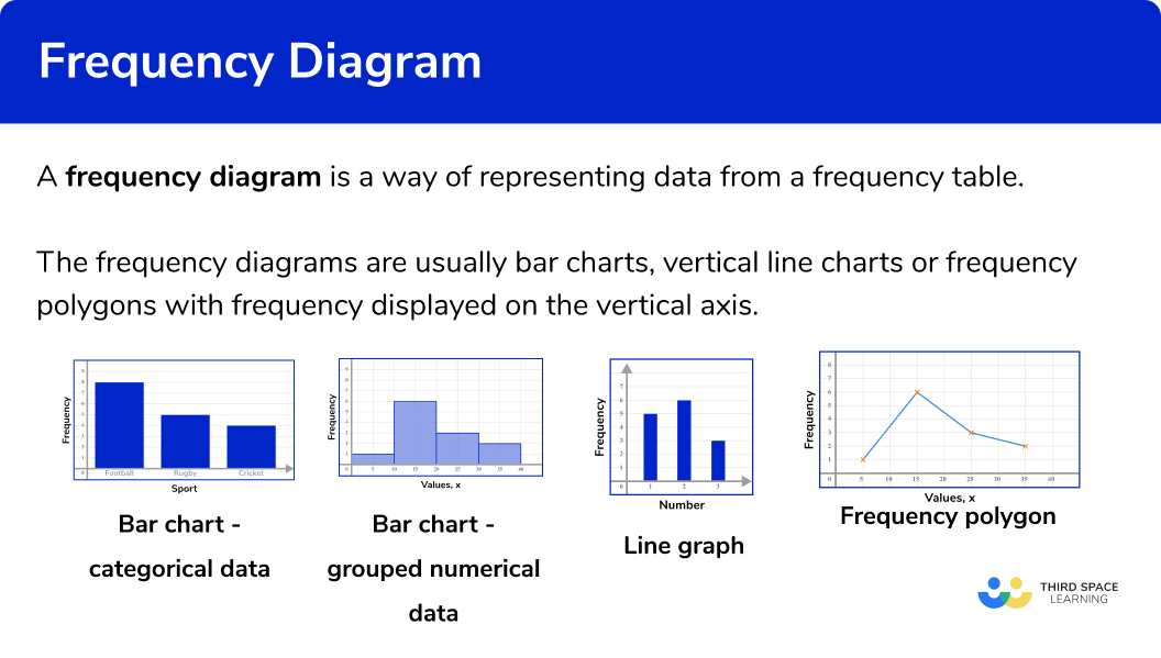
Bar charts
Bar charts represent data using rectangular bars that are the same width. They can be used for categorical data (such as favourite colour, types of food, or makes of car) or numerical data (such as goals scored, height, or time).
Bar charts can also be used for grouped numerical data.
Step-by-step guide: Bar charts
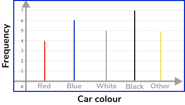
Vertical line charts
Vertical line charts represent data by drawing straight lines to a given frequency.
They can be used for ungrouped numerical data.
Frequency polygons
A frequency polygon is a graph that shows the frequencies of grouped data. It is a type of frequency diagram that plots the midpoints of the class intervals against the frequencies and then joins up the points with straight lines.
Step-by-step guide: Frequency polygon
How to draw a frequency diagram
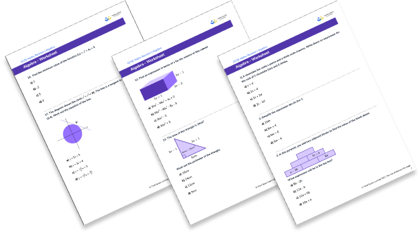
In order to draw a frequency diagram:
- Draw a pair of axes and label them.
- Draw a bar (or vertical line) for each of the items.
How to draw a frequency diagram
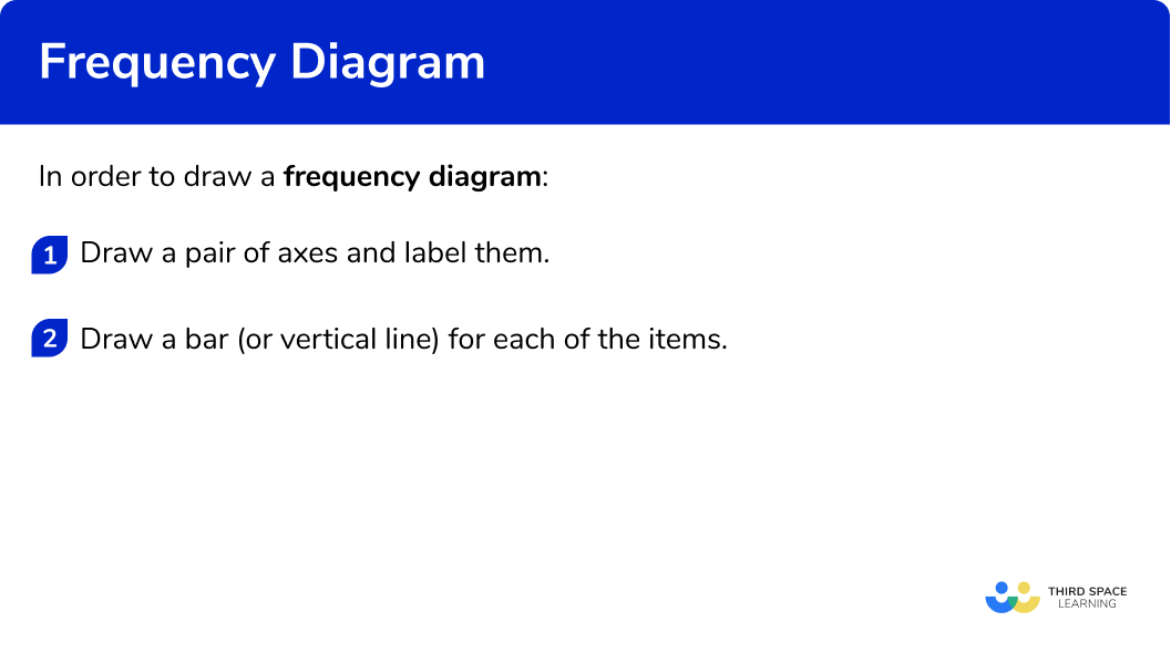
Frequency polygon worksheet (includes frequency diagram)

Get your free frequency diagram worksheet of 20+ frequency polygon questions and answers. Includes reasoning and applied questions.
DOWNLOAD FREE
Frequency polygon worksheet (includes frequency diagram)

Get your free frequency diagram worksheet of 20+ frequency polygon questions and answers. Includes reasoning and applied questions.
DOWNLOAD FREERelated lessons on representing data
Frequency diagram is part of our series of lessons to support revision on representing data. You may find it helpful to start with the main representing data lesson for a summary of what to expect, or use the step by step guides below for further detail on individual topics. Other lessons in this series include:
Frequency diagram examples
Example 1: categorical data – bar chart
Draw a bar chart for this data:
- Draw a pair of axes and label them.
Look at what the highest frequency is. The vertical axis for the frequency needs to go up at least as high as this frequency. The categories should be evenly spaced along the horizontal axis.
2Draw a bar (or vertical line) for each of the items.
The heights of the bars need to correspond with their frequencies. The bars should have equal width.
Example 2: categorical data – bar chart
Draw a bar chart for this data:
Draw a pair of axes and label them.
Look at what the highest frequency is. The vertical axis for the frequency needs to go up at least as high as this frequency. The categories should be evenly spaced along the horizontal axis.
Draw a bar (or vertical line) for each of the items.
The heights of the bars need to correspond with their frequencies. The bars should have equal width.
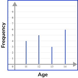
Example 3: ungrouped numerical data – vertical line chart
Draw a vertical line chart for this data:
Draw a pair of axes and label them.
Look at what the highest frequency is. The vertical axis for the frequency needs to go up at least as high as this frequency. The categories should be evenly spaced along the horizontal axis.
Draw a bar (or vertical line) for each of the items.
The heights of the vertical lines need to correspond with their frequencies.
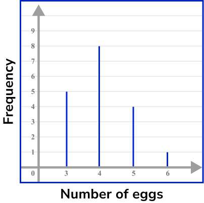
Example 4: ungrouped numerical data – vertical line chart
Draw a vertical line chart for this data:
Draw a pair of axes and label them.
Look at what the highest frequency is. The vertical axis for the frequency needs to go up at least as high as this frequency. The categories should be evenly spaced along the horizontal axis.
Draw a bar (or vertical line) for each of the items.
The heights of the vertical lines need to correspond with their frequencies.
Example 5: grouped numerical data – bar chart
Draw a bar chart for this grouped data:
Draw a pair of axes and label them.
Look at Look at what the highest frequency is. The vertical axis for the frequency needs to go up at least as high as this frequency. Use the ends of the class intervals to help put the numbers on the horizontal axis – 0, 100, 200 and so on.
Draw a bar (or vertical line) for each of the items.
The heights of the bars need to correspond with their frequencies. The bars should have equal width.
Example 6: grouped numerical data – bar chart
Draw a bar chart for this grouped data:
Draw a pair of axes and label them.
Look at what the highest frequency is. The vertical axis for the frequency needs to go up at least as high as this frequency. Use the ends of the class intervals to help put the numbers on the horizontal axis – 0, 10, 20 and so on.
Draw a bar (or vertical line) for each of the items.
The heights of the bars need to correspond with their frequencies.
Common misconceptions
- Equal widths
The bars for frequency diagrams should all have the same width. The vertical lines should also have the same thickness.
- Frequencies are whole numbers
Since frequencies are a count of how many times an item occurs, they will always be integers. They are not decimals.
- Gaps between bars
For categorical data, there should be a gap between each bar on a bar chart. This allows the data to be easier to interpret.
Practice frequency diagram questions
1. Choose the correct frequency table for the following frequency diagram:


The frequency for Blonde is 4, the frequency for Brown is 5, the frequency for Black is 3 and the frequency for Red is 1.
2. Choose the correct frequency table for the following frequency diagram:


The frequency for Sheep is 5 , the frequency for Cow is 3 , the frequency for Pig is 1 and the frequency for Chicken is 6 .
3. Choose the correct frequency table for the following frequency diagram:


The frequency for 0 siblings is 7 , the frequency for 1 sibling is 5 and the frequency for 2 siblings is 2 .
4. Choose the correct frequency table for the following frequency diagram:


The frequency for 3 apples is 7 , the frequency for 4 apples is 9 , the frequency for 5 apples is 6 , the frequency for 6 apples and the frequency for 7 apples is 1 .
5. Choose the correct grouped frequency table for the following grouped frequency diagram:


The frequency is 2 for values in the range 0-100cm , the frequency is 4 for values in the range of 100-200cm, the frequency is 7 for values in the range of 200-300cm and the frequency is 3 for values in the range of 300-400cm.
6. Choose the correct grouped frequency table for the following grouped frequency diagram:


The frequency for 0-10 \; kmph is 5 , the frequency for 10-20 \; kmph is 8 , the frequency for 20-30 \; kmph is 4 and the frequency for 30-40 \; kmph is 1.
Frequency diagram GCSE questions
1. Will recorded the different types of birds visiting his garden.
The table shows his results.
(a) Complete the bar chart to show Will’s results.
(b) How many more sparrows than robins were there?
(3 marks)
(a)
(2)
(b)
12
(1)
2. Laine recorded the number of bedrooms in different houses on an estate.
The table shows her results.
(a) Complete the vertical line chart to show Laine’s results.
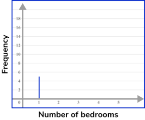
(b) How many houses have at least 3 bedrooms?
(3 marks)
(a)
(2)
(b)
30
(1)
3. Here is a frequency diagram showing the times of people solving a sudoku problem.
(a) Complete the grouped frequency table.
(b) How many people were there altogether who did the sudoku?
(3 marks)
(a)
(2)
(b)
18
(1)
Learning checklist
You have now learned how to:
- Construct and interpret appropriate tables, charts, and diagrams, including frequency tables, and bar charts for categorical data, and vertical line (or bar) charts for ungrouped and grouped numerical data.
The next lessons are
Still stuck?
Prepare your KS4 students for maths GCSEs success with Third Space Learning. Weekly online one to one GCSE maths revision lessons delivered by expert maths tutors.

Find out more about our GCSE maths tuition programme.