High Impact Tutoring Built By Math Experts
Personalized standards-aligned one-on-one math tutoring for schools and districts
In order to access this I need to be confident with:
Input/output tables Equivalent expressions Algebraic expressions InequalitiesTypes of graphs
Here you will learn about types of graphs, including points on the coordinate plane, linear graphs, plotting linear equations, and interpreting linear graphs.
Students first learn about graphs in the early grades when gathering and plotting data on line graphs and circle graphs with their work in measurement and data.
In the 6th grade, students begin to work with the coordinate plane in order to graph ordered pairs with their work in expressions and equations.
Every week, we teach lessons on different types of graphs to students in schools and districts across the US as part of our online one-on-one math tutoring programs. On this page we’ve broken down everything we’ve learnt about teaching this topic effectively.
What are types of graphs?
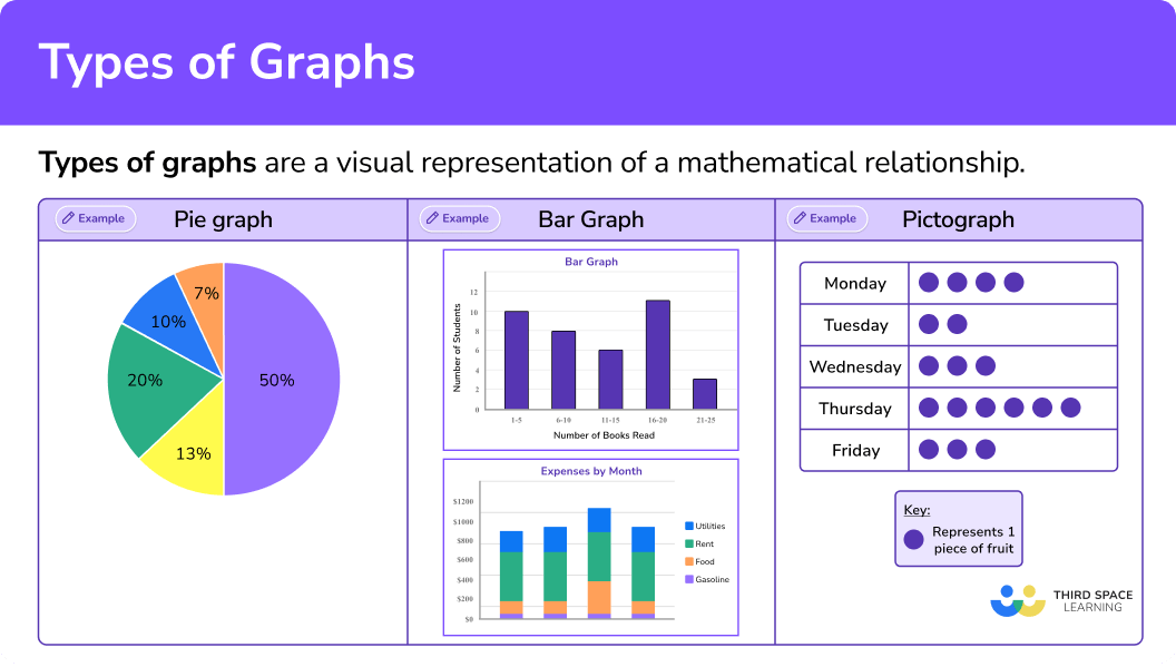
Types of graphs are visual representations of mathematical relationships. Types of graphs can include points, straight lines, curves, polygons, and circles, depending on the type of graph that is needed.
Graphing is a major component to the understanding of mathematics because it provides a visual representation of a mathematical relationship. Let’s look at different types of charts and graphs.
| Name of graph | Sample of graph |
|---|---|
Pie graph: |  |
Pictograph: | 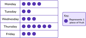 |
Bar Graph: | 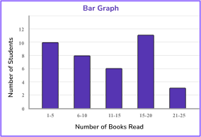 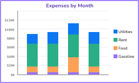 |
Line Graph: | 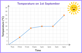 |
Box and whisker plot: |  |
Coordinate plane: | 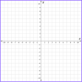 |
Scatter plot: | 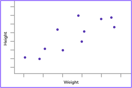 |
Venn diagram: | 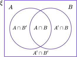 |
Types of Graphs Worksheet

We’ve saved you time with this quick and easy worksheet covering 5th to 8th grade types of graphs (focusing on coordinate planes, linear vs non-linear graphs). Identify learning gaps and test your students’ understanding in the classroom.
DOWNLOAD FREE
Types of Graphs Worksheet

We’ve saved you time with this quick and easy worksheet covering 5th to 8th grade types of graphs (focusing on coordinate planes, linear vs non-linear graphs). Identify learning gaps and test your students’ understanding in the classroom.
DOWNLOAD FREECoordinate plane and plotting points
Let’s focus on the coordinate plane and how it is used.
| \textbf{x} axis and \textbf{y} axis:
The x axis and y axis are straight lines that make up the coordinate plane, where 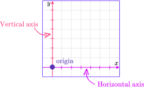 |
The x axis and y axis divides the plane 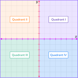 | Points on the coordinate plane are 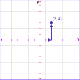 |
Each quadrant has unique characteristics.
| Quadrant I | Quadrant II | Quadrant III | Quadrant IV |
|---|---|---|---|
(x, y) | (x, y) | (x, y) | (x, y) |
Step by step guide: Coordinate plane
The coordinate plane can be used to find the distance between points.
For example, plot the coordinates A \, (-2, 3) and B \, (6, 3) on the coordinate plane and then find the distance between the points.
Plot the points and then count the units between the points.
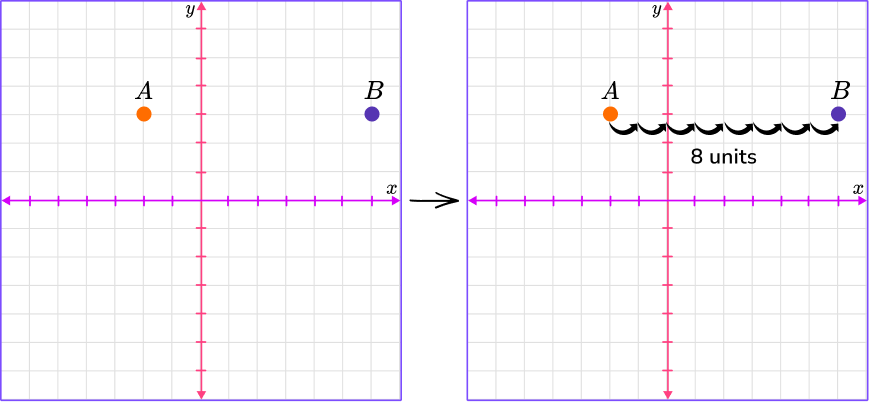
Count the number of units from point A to point B. It is 8 units. You can also find the absolute value of the difference to find the distance.
|-2-6|=|-8|=8
Step by step guide: Plot points on a graph.
Linear graphs
Linear graphs are graphs that form straight lines on a coordinate plane.
For example, the graphs below show linear graphs because they are straight lines.
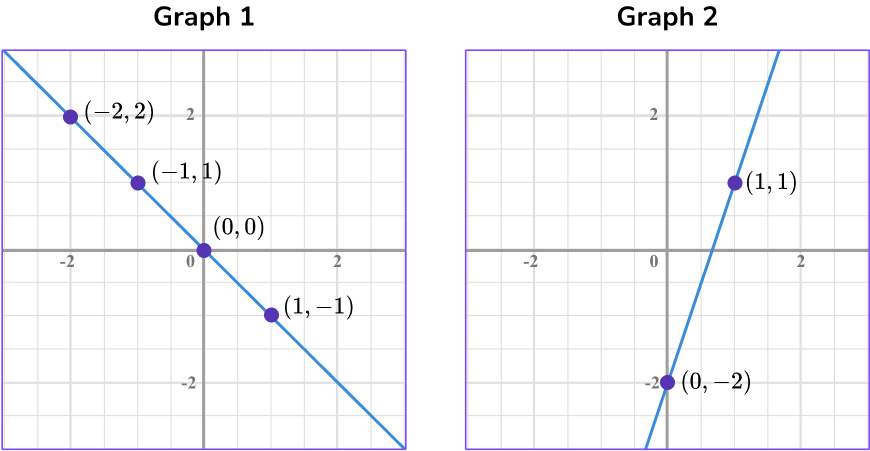
Linear graphs can represent proportional relationships if they contain the point (0, 0).
If a linear graph is proportional, the points have a common ratio in the form of \, \cfrac{y}{x} \, .
Graph 1 is a proportional relationship because the line passes through the origin, (0, 0) and the points have a common ratio of \, \cfrac{-1}{1} \, .
Graph 2 is not a proportional relationship because the line does not pass through the origin and the points do not have a common ratio.
Step-by-step guide: Linear graphs
Equations can represent linear relationships and be graphed on the coordinate plane.
For example, graph the equation y=\cfrac{1}{2} \, x on the coordinate graph by making a table of values.
The x -coordinate is the independent variable, so you can choose any value you want for x. Substitute the values of x into the equation to find the y -coordinates.
The y -coordinate is the dependent variable because it’s value depends on the x value.
| x | y=\cfrac{1}{2} \, x | y | (x,y) |
|---|---|---|---|
| -2\;\; | \begin{aligned} y&=\cfrac{1}{2} \, (-2) \\ y&=-1 \end{aligned} | -1\;\; | (-2, -1) |
| 0 | \begin{aligned} y&=\cfrac{1}{2} \, (0) \\ y&=0 \end{aligned} | 0 | (0, 0) |
| 2 | \begin{aligned} y&=\cfrac{1}{2} \, (2) \\ y&=1 \end{aligned} | 1 | (2, 1) |
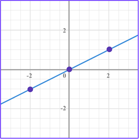
The equation y=\cfrac{1}{2} \, x is a linear graph, and it passes through the origin.
Also, the ratio of the points in the form of \, \cfrac{y}{x} \, is \, \cfrac{1}{2} \, .
\begin{aligned} &(2,1) \, \rightarrow \, \cfrac{1}{2}\\\\ &(-2,-1) \, \rightarrow \, \cfrac{-1}{-2}=\cfrac{1}{2} \end{aligned}
Direct variation
Linear equations in the form of y=kx represent proportional relationships where k is the common ratio, which also represents the constant of proportionality.
The equation y=kx can be called direct variation.
Direct variation is when x, the independent variable, varies directly with y, the dependent variable. This means that the ratio between the x -coordinate and the y -coordinate is constant.
For example, if x and y vary directly, find the equation of direct variation when x = 3 and y = 12.
The x -coordinate and y -coordinate vary directly, which means the ratio of the x and y coordinates is the same or constant.
\begin{aligned} & k=\frac{y}{x} \\\\ & k=\frac{12}{3}=4 \end{aligned}
Since k=4 , the equation of direct variation is y=4x .
Step by step guide: Direct Variation
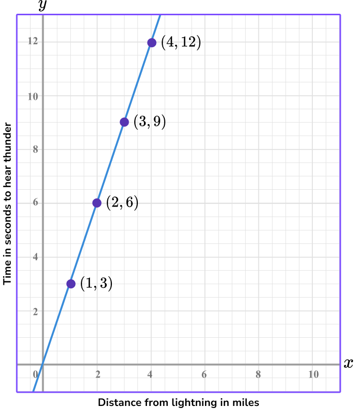
Graphs can be used to represent real world situations where you may be asked to interpret the graph.
Make sure to look at the key information on the graph. You may be asked to read a value from the graph, interpret a point on the graph, or find a constant of variation (proportionality) from the graph.
For example, the graph represents a proportional, linear relationship where the distance you are from lightning varies directly with the time it takes for you to hear the thunder. Interpret the point (4, 12) from the graph.
Step-by-step guide: Interpreting graphs
What are types of graphs?
Common Core State Standards
How does this relate to 6th grade math, 7th grade math, and 8th grade math?
- Grade 6 – Number System (6.NS.C.6.b)
Understand signs of numbers in ordered pairs as indicating locations in quadrants of the coordinate plane; recognize that when two ordered pairs differ only by signs, the locations of the points are related by reflections across one or both axes.
- Grade 6 – The Number System (6.NS.C.8)
Solve real-world and mathematical problems by graphing points in all four quadrants of the coordinate plane. Include use of coordinates and absolute value to find distances between points with the same first coordinate or the same second coordinate.
- Grade 6 – Geometry (6.G.A.3)
Draw polygons in the coordinate plane given coordinates for the vertices; use coordinates to find the length of a side joining points with the same first coordinate or the same second coordinate. Apply these techniques in the context of solving real-world and mathematical problems.
- Grade 6 – Expressions and Equations (6.EE.C.9)
Use variables to represent two quantities in a real-world problem that change in relationship to one another; write an equation to express one quantity, thought of as the dependent variable, in terms of the other quantity, thought of as the independent variable. Analyze the relationship between the dependent and independent variables using graphs and tables, and relate these to the equation.
- Grade 7 – Ratios and Proportional Relationships (7.RP.A.2.b)
Identify the constant of proportionality (unit rate) in tables, graphs, equations, diagrams, and verbal descriptions of proportional relationships.
- Grade 7 – Ratios and Proportional Relationships (7.RP.A.2.d)
Explain what a point (x, y) on the graph of a proportional relationship means in terms of the situation, with special attention to the points (0, 0) and (1, r) where r is the unit rate.
- Grade 8 – Expressions and Equations (8.EE.B.5)
Graph proportional relationships, interpreting the unit rate as the slope of the graph.
How to recognize types of graphs
In order to recognize types of graphs:
- Identify the graph as a linear relationship or a non-linear relationship.
- Identify if the linear relationship represents direct variation.
Recognize types of graphs examples
Example 1: recognize the types of graphs
Does the graph represent a linear relationship?
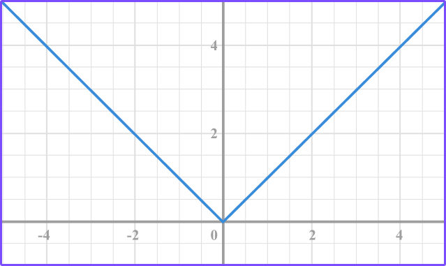
- Identify the graph as a linear relationship or a non-linear relationship.
The graph is a non-linear relationship because it does not form a straight line.
2Identify if the linear relationship represents direct variation.
The graph is not linear.
Example 2: recognize the types of graphs
Does the graph represent a linear relationship?
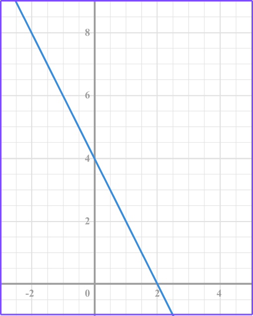
Identify the graph as a linear relationship or a non-linear relationship.
The graph is a linear relationship because it forms a straight line.
Identify if the linear relationship represents direct variation.
The graph is a linear relationship but it does not represent direct variation because the line does not pass through the origin, (0, 0).
Example 3: recognize the types of graphs
Classify each of the graphs as linear or non-linear.
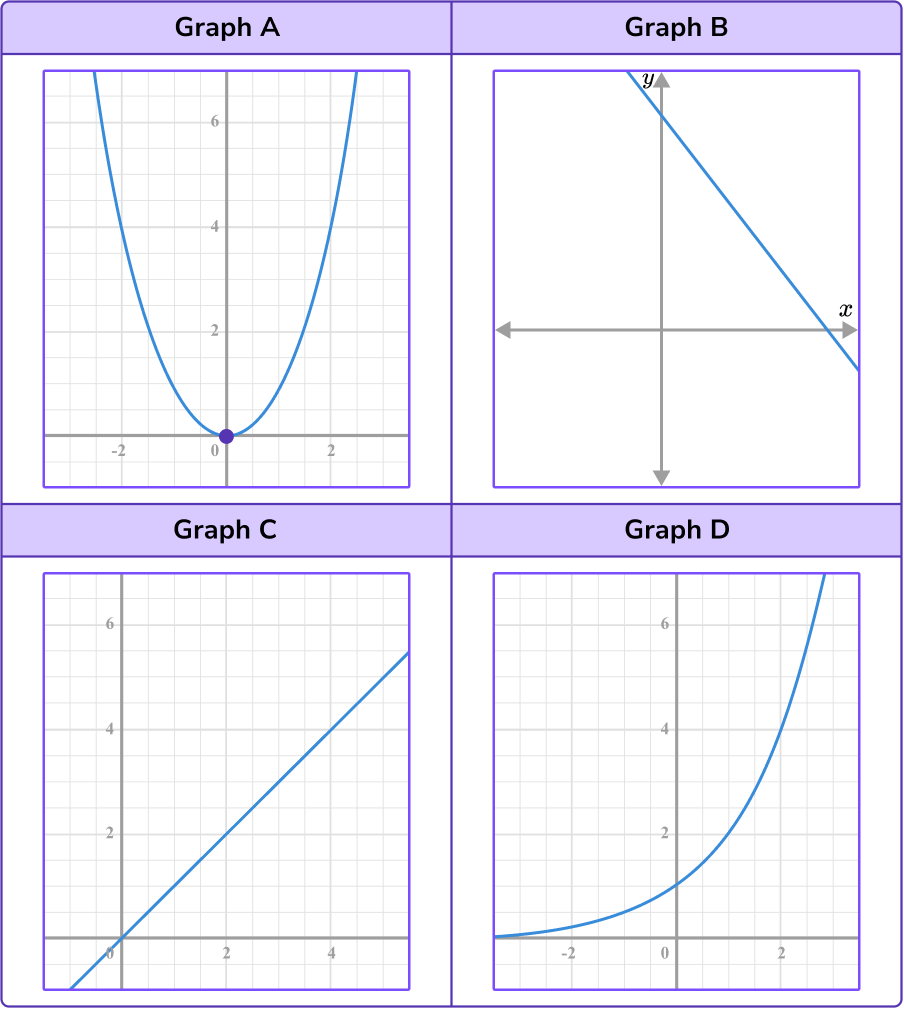
Identify the graph as a linear relationship or a non-linear relationship.
Graph A is a non-linear relationship because it is not a straight line.
Graph B is a linear relationship because it forms a straight line.
Graph C is a linear relationship because it forms a straight line.
Graph D is a non-linear relationship because it does not form a straight line.
Identify if the linear relationship represents direct variation.
Graph C is a linear graph that represents a direct variation because the line passes through the origin.
How to plot types of graphs
In order to plot different types of graphs
- Complete the table of values.
- Plot the coordinates.
- Draw a straight line through the points.
Example 4: plot types of graphs
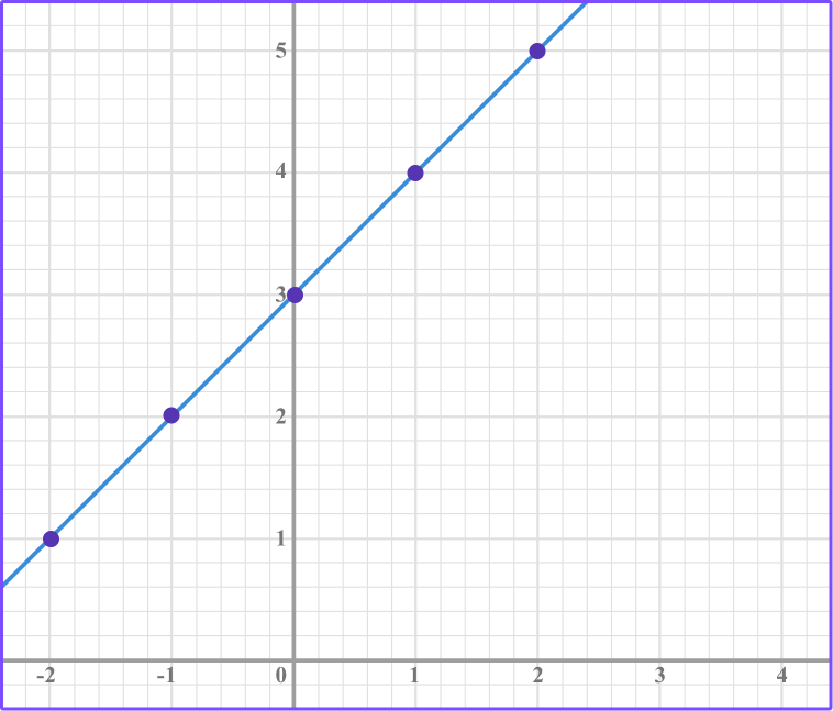
Plot the graph represented by the equation y=x +3.
Complete the table of values.
Substitute the values of x into the equation, y=x +3. Write the values of y in the table.

Plot the coordinates.
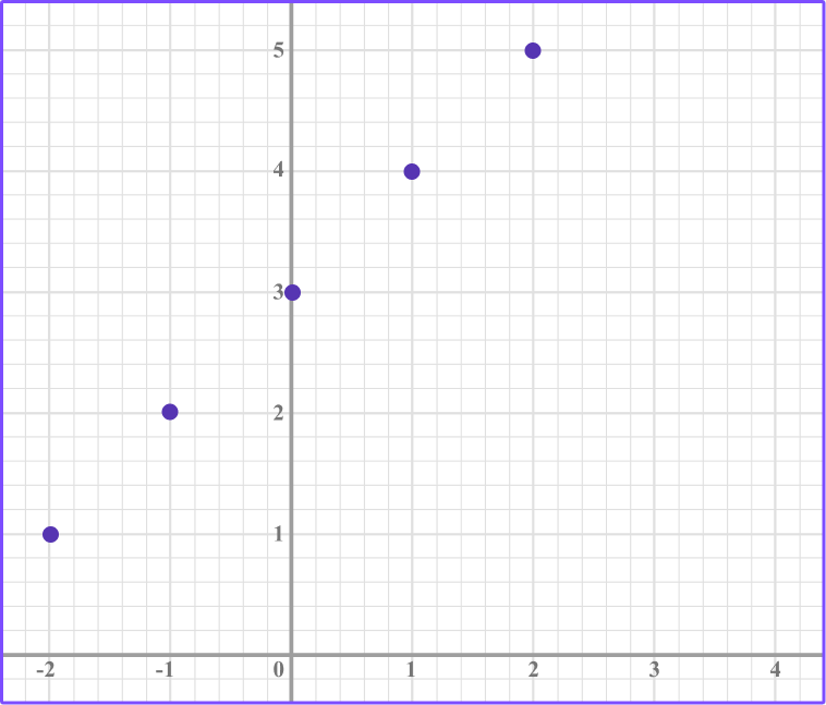
Draw a straight line through the points.
Example 5: plot types of graphs
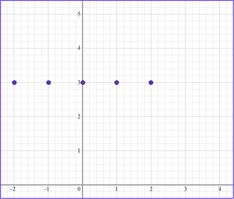
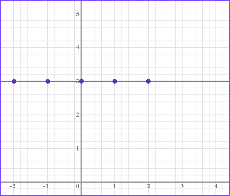
Plot the graph represented by the equation y=3.
Complete the table of values.
In this case the the y value will be -2 for each x value.

Plot the coordinates.
Draw a straight line through the points.
Example 6: plot types of graphs
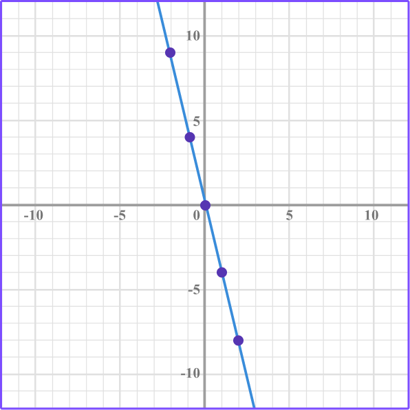
Plot the graph represented by the equation y=-4x.
Complete the table of values.
Substitute the values of x into the equation, y=-4x. Write the values of y in the table.

Plot the coordinates.
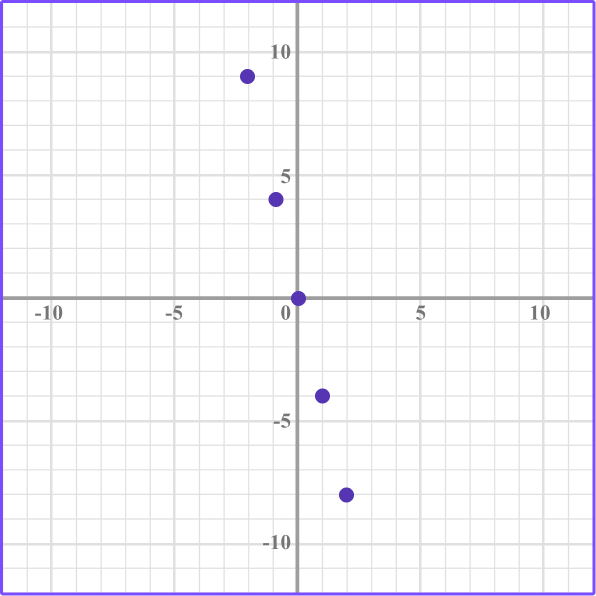
Draw a straight line through the points.
Teaching tips for types of graphs
- Creating and interpreting graphs is an essential skill in mathematics. Graphs help to organize mathematical information while also providing a visual model. Be sure to emphasize these skills in the classroom as they lead to data literacy.
- Using discovery-based activities which provide students with the opportunity to compare and contrast graphs and connect linear equations to the graphs they represent helps students formulate their own understanding.
- Infuse graphs that represent real world situations so that students can connect the math concepts to the world around them.
Easy mistakes to make
- Making arithmetic errors when substituting \textbf{x} values into the equation which produces incorrect \textbf{y} -values
- Plotting a point incorrectly
If there is a point that does not join up with the other points when you draw a smooth line, go back and check the coordinate. In the example below, there is a point that does not lie on the line so needs checking.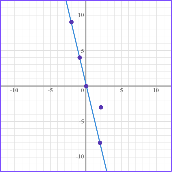
Practice types of graphs questions
1. Identify the graph that represents a direct variation.
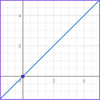

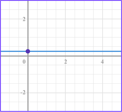

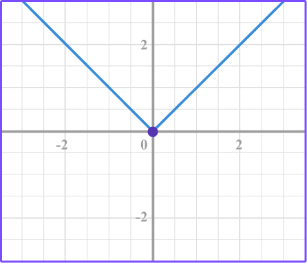


The linear graph that passes through the origin represents direct variation.
2. Select the graph that represents a linear relationship that isn’t proportional.


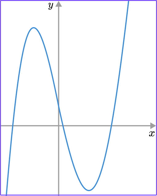

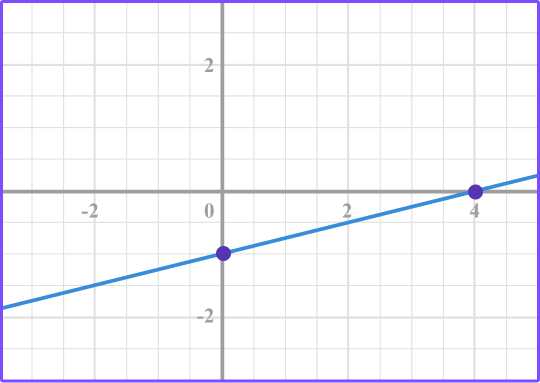


The graph shows a linear relationship that does not pass through the origin which means that it is a linear relationship that is not proportional.
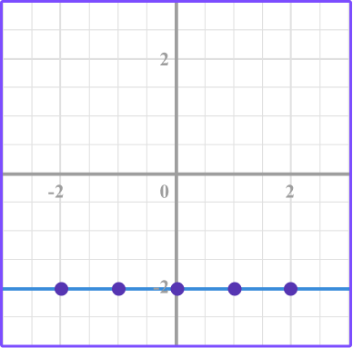
3. Which graph represents the equation y=-2?
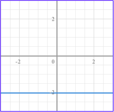

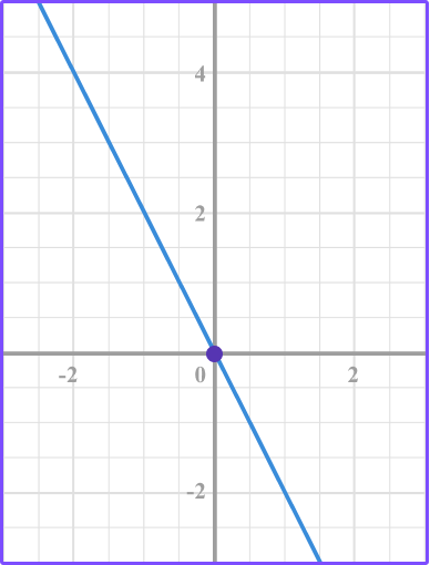

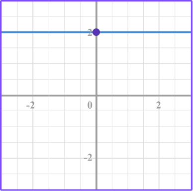

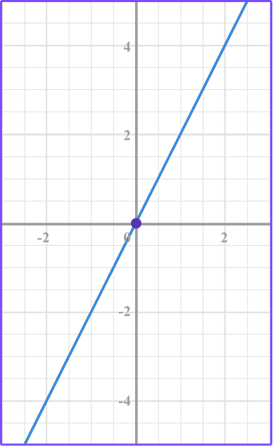

Make a table of values for the equation y=-2.
The y -value is -2 for each of the different x -values.

Plot the points.
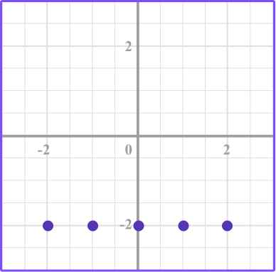
Then connect the point with a smooth line.
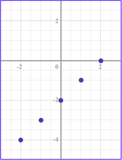
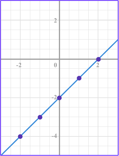
4. Identify the correct graph for this equation: y=x-2
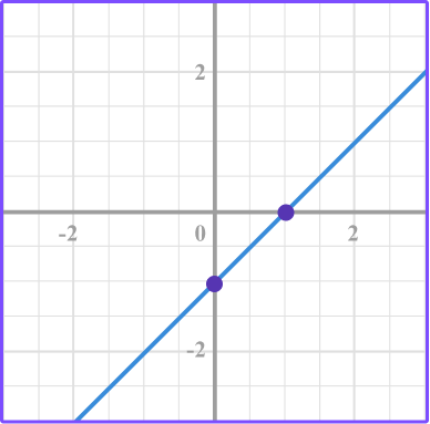

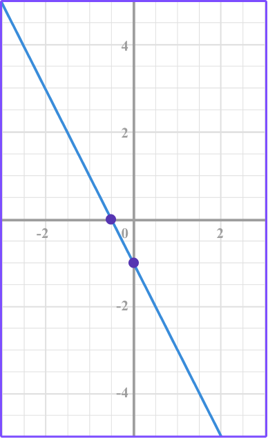

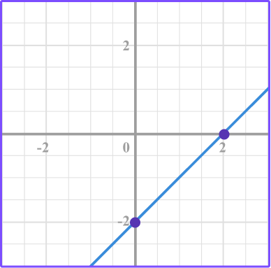


Make a table of values for the equation y=x-2.
Substitute the x values into the equation to find the y values.

Plot the points.
Connect the points.
5. Which equation represents the linear graph?
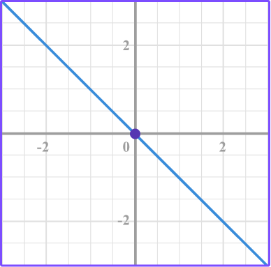


The linear equation y=-x represents a proportional relationship or direct variation because it is in the form of y=kx where k=-1.
Also, it’s the only equation that has the point (0, 0).
6. Which equation represents the linear graph?
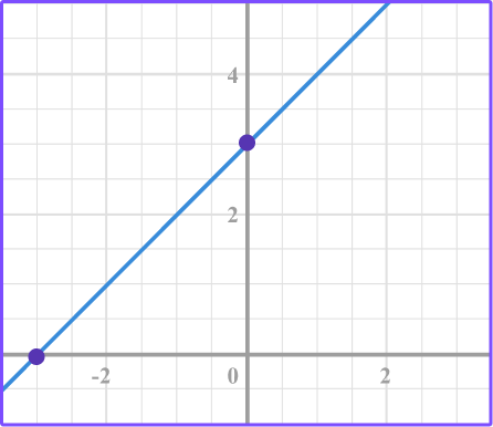


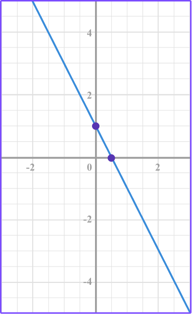
Looking at the graph you can see that it does not pass through the origin so it will not be a proportional relationship.
Therefore, the equation will not be in the form of y=kx.
When you substitute values for x into the equation, y=x+3, the point (-2, 1), (-1, 2), (0, 3), (1, 4),(2, 5) exists on the line which matches the graph.
Types of graphs FAQs
No, as you move through high school you will graph curves such as quadratic functions, exponential functions, and other polynomial functions.
Yes, when you learn algebra you will learn about linear equations in slope-intercept form, point-slope form, and standard form.
Making a table of values is a method that will always work when plotting a linear equation. However, in algebra you will learn other methods that require less arithmetic such as using slope, y -intercept, and x -intercept.
There are many different kinds of graph types. In algebra, you will use the coordinate plane and analyze scatter plots. In a statistics class, you will use statistical graphs and charts depending on the different data collected.
A histogram is used to graph frequency distributions and is quite similar to a bar graph.
No, there are many digital tools you can use to graph data sets such as excel, Google sheets, Desmos, etc.
No, in high school you will be exposed to statistics where you learn in depth about the various ways to display and analyze data. Other charts and graphs you will learn about are waterfall charts in excel, area graphs, bubble graphs, to name a few.
The next lessons are
Still stuck?
At Third Space Learning, we specialize in helping teachers and school leaders to provide personalized math support for more of their students through high-quality, online one-on-one math tutoring delivered by subject experts.
Each week, our tutors support thousands of students who are at risk of not meeting their grade-level expectations, and help accelerate their progress and boost their confidence.

Find out how we can help your students achieve success with our math tutoring programs.
[FREE] Common Core Practice Tests (3rd to 8th Grade)
Prepare for math tests in your state with these 3rd Grade to 8th Grade practice assessments for Common Core and state equivalents.
Get your 6 multiple choice practice tests with detailed answers to support test prep, created by US math teachers for US math teachers!